Dystopia
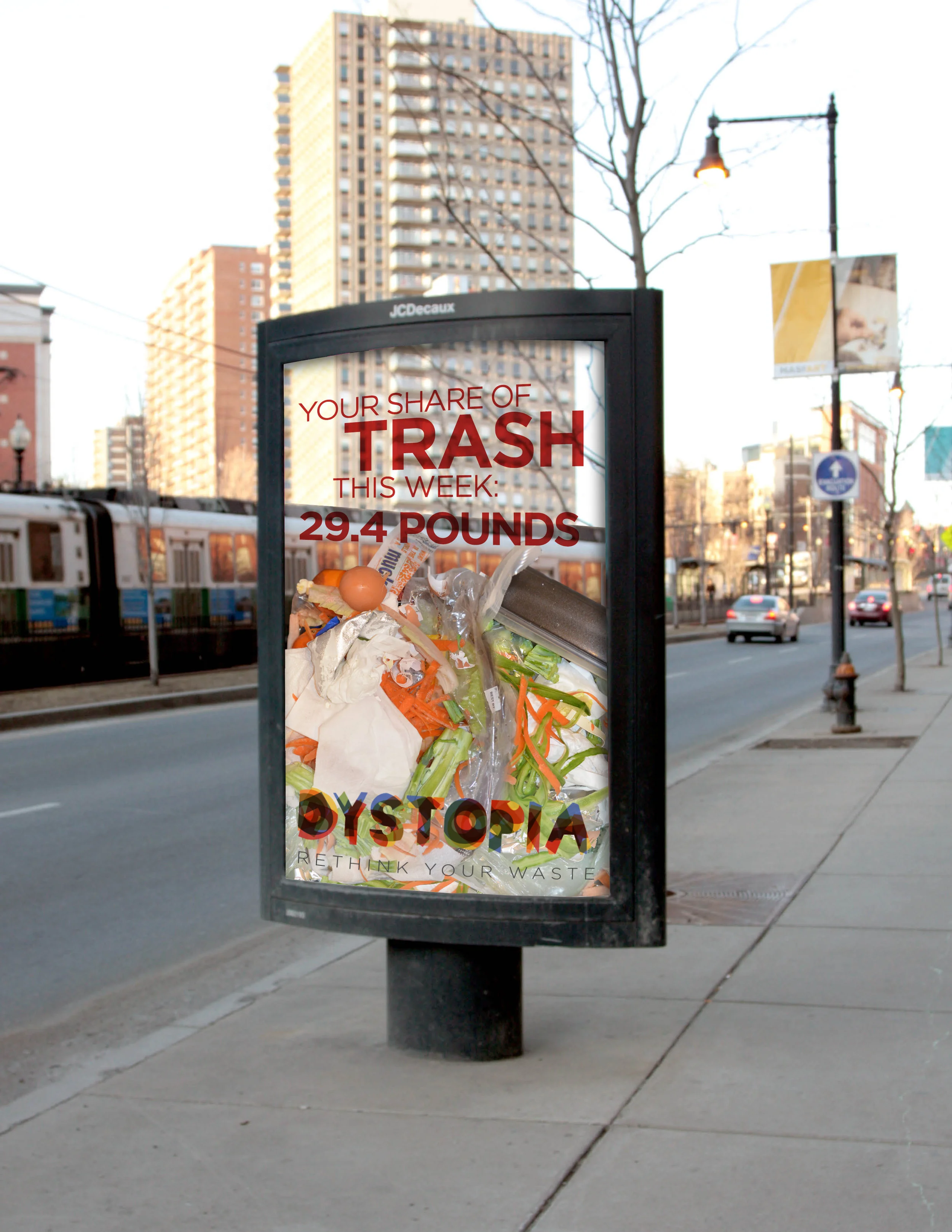
The Dystopia campaign aims to bring awareness to a specific area of sustainability—consumption. It uses real trash in public spaces to catch consumers off guard in their personal habitual space. It displays excess in a way that brings awareness towards more sustainable living.
The logo uses a series of overlaid, colorful type to depict not only the muck of trash, but the beauty and process of decay. It is displaced, yet contained—two central themes to the campaign.
Role / Design Lead
Client / Grad school
Focus / Awareness Campaign, Branding, Marketing
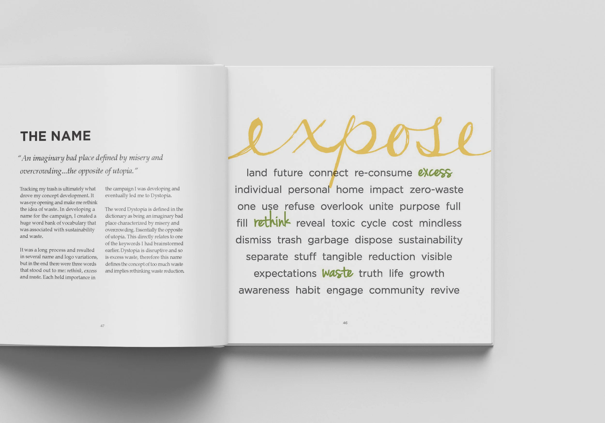
In addition to the campaign, I also documented my research and process. View the complete book here.
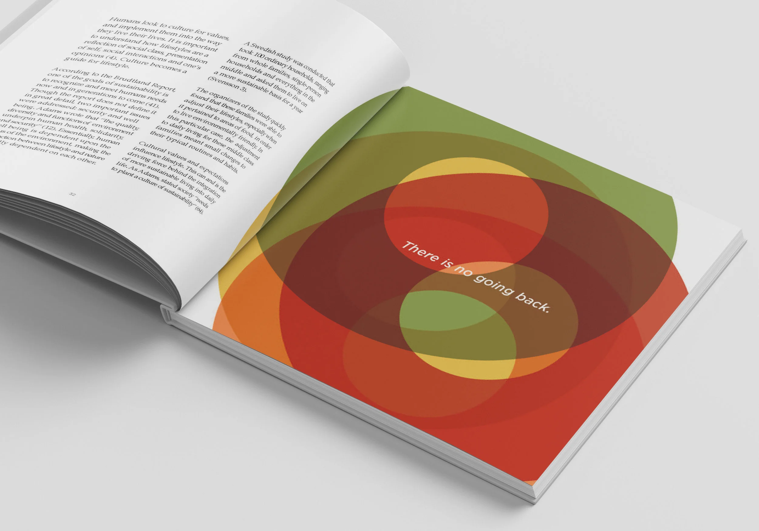
Throughout the research process for this project, I had been collecting and recording my own trash. This became the inspiration behind the logo and layering styles that were developed.
While trying to decide on a name for the campaign, I was also working on sketches for the logo.


